designBouts.com
designBouts.com is a platform that administers architectural contests. It celebrates design merit. Clients request to have their commission posted and designers compete to win the commission. The client is guaranteed an executable proposal. The winning designer is paid. Unsuccesful designers receive feedback as to why they did not excel and assurance that their ideas will not be stolen. All completed submissions receive a payment. The value for Clients is that they are exposed to a wider pool of designers and design possibilites; while for designers it is a platform for them to showcase their ability to a broader array of clients who are interested in design. Their client pool is not limited to their network.
The site is designed for both android and ios operating systems and for mobile and desktop devices. It is presented from a client’s point of view since they are likely to be new users while the designers are likely to be returning ones. I designed the logo, the UX and the graphics and managed the SEO and analytics. The site is a continuous rolling carousel. The metaphor of a boxing bout informs the the styling and diction of the site.
Due to the site’s main audience being clients it is more informative and introductory. This is to allow users to feel in control and to avoid them feeling as if they need to commit to anything or as if the site is gathering info or learning about them in any way.
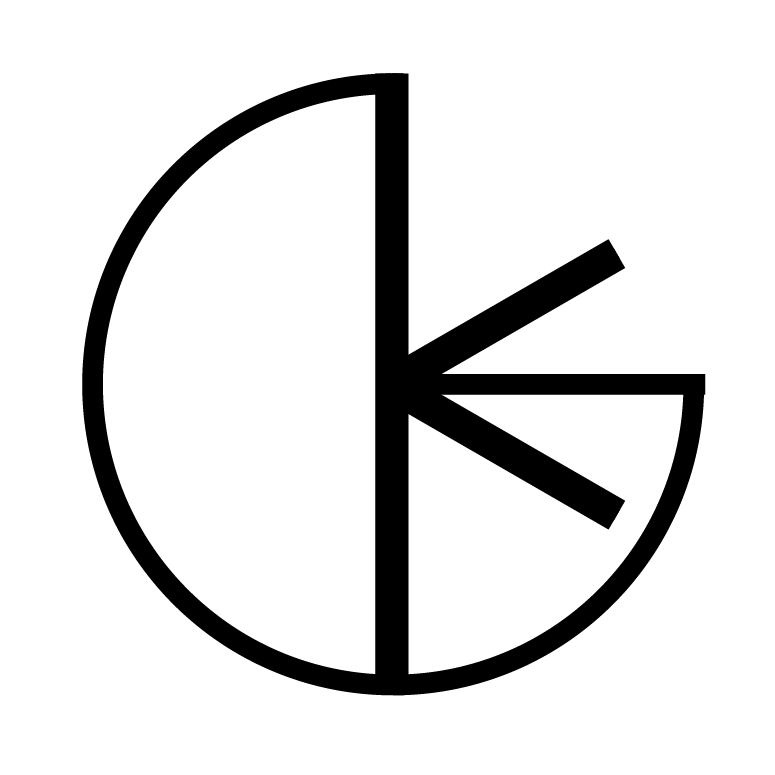
The logo combines abstractions of the two benefits the site provides: better and more appropriate ideas (represented by the light bulb) and constructive conflict or fair competition (the boxing glove).
The logo is then manipulated to create other artwork, like icons. On the ‘how it works’ page for example: the logo becomes a light bulb. It represents ‘idea formation’, which is what happens in the particular ‘create a brief’ stage of the process. Similarly, the logo becomes two clashing boxing gloves. It represents ‘constructive collisions’, which is what happens in the particular ‘set up your competition’ stage of the process. Finally, it becomes a rosette to represent ‘the winner’, which is what happens in the ‘choose the winner’ or adjudication stage.

the ‘create your brief’ icon is an abstracted light bulb

the ‘set up your competition’ icon is two clashing boxing gloves

the ‘choose your winner’ icon is a rosetta


